
Art & Design
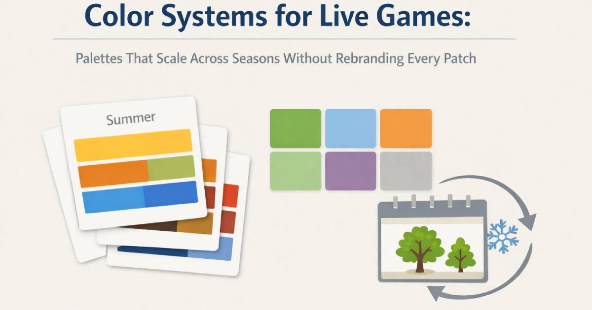
Color Systems for Live Games: Palettes That Scale Across Seasons Without Rebranding Every Patch
April 1, 2026 / Orion's Gate Team
A live game needs color that can evolve-without breaking recognition. Learn a practical color system for live-service games: base palette, seasonal accents, event overlays, rarity ramps, UI contrast rules, and accessibility tooling. Includes a sprint-ready checklist and numbered references.
Why live games need a color system, not a color “vibe”
If your game ships seasonal events, battle passes, rotating shops, and weekly promotions, color becomes more than art direction-it becomes governance. The risk is familiar: every update adds new banners, frames, VFX, and cosmetics until the game feels like five brands stitched together.
A color system solves that by giving you rules that scale:
Your world stays recognizable.
Events feel fresh without repainting everything.
UI remains readable across devices and lighting conditions.
Accessibility doesn't regress with every patch.
This post shows how to build a palette that survives live ops.
1) Start with a “Base Palette” that never changes
Think of your Base Palette as the game's permanent identity-the colors players associate with your world even in a blurred thumbnail.
Build it like this:
Neutrals (6-10): background values, panels, borders, shadows.
Core chroma (8-12): your world's signature hues (biomes, factions, brand color).
Functional UI colors (6-8): success, warning, error, info, selection, disabled.
Rule: your Base Palette is the “law.” Everything seasonal is an overlay, not a replacement.
2) Use Seasonal Accents, not Seasonal Makeovers
Live games often overcorrect: winter arrives and suddenly the entire UI becomes icy blue. Players feel like the game “changed,” not “celebrated.”
Instead, define Seasonal Accent Packs:
1 primary accent hue
1 secondary accent hue
1 highlight tone (sparkle, glow, premium cue)
These accent packs should only touch:
event signage and banners
limited-time UI frames
ambient props (lanterns, confetti, festival lights)
small VFX flourishes (not core readability)
Result: players feel the season everywhere, but the brand stays intact.
3) Build an “Event Overlay Layer” for shops and promotions
Most palette chaos comes from the monetization surface: store cards, pop-ups, limited bundles, countdown badges.
Treat store/event visuals like a separate layer with strict constraints:
background values must stay within your neutral range
promotional color may only occupy X% of the screen
all call-to-action buttons must remain within your functional UI palette
When designers follow a consistent overlay layer, your shop can run 200 promos a year and still look like your game.
4) Define a Rarity Ramp that works in every biome
Rarity is where color systems go to die: too many gradients, too many glows, and suddenly the world looks like an arcade.
Create a rarity ramp with two protections:
Hue + shape, not hue alone (color-blind safe and clearer at speed).
Value discipline: rare items are brighter or higher-contrast than common items, but never “white-hot” everywhere.
For accessible color usage, don't rely on color alone to communicate state-add labels, icons, shapes, or patterns. Section 508 guidance is blunt on this: color should not be the only means of conveying information. [2]
5) Lock contrast rules early (or UI breaks every season)
If your team doesn't have contrast thresholds, they'll reinvent them (badly) each update.
A simple standard:
Text contrast: at least 4.5:1 for normal text (WCAG) [1]
UI components (borders, buttons, controls): at least 3:1 against adjacent colors (WCAG guidance summarized in accessibility developer references) [3]
This prevents “cute seasonal UI” from becoming unreadable seasonal UI. It also reduces support tickets because players can actually parse the interface.
6) Make accessibility testing part of art production (not a final QA panic)
Color accessibility is easiest when it's a tool in the pipeline, not a last-minute audit.
Two practical moves:
Simulate color vision deficiency early. Ubisoft released Chroma, a colorblind simulation tool, for public use-designed so teams can test screens and adjust before shipping. [4]
Use simulators + contrast checkers for meaningful info. Filament Games notes they test through color blindness simulators and contrast checkers and make adjustments so more players can enjoy the experience. [5]
This is where a color system pays off: when you update your seasonal accent pack, you can validate it once against the system instead of re-testing the entire UI from scratch.
7) “Palette Budgeting” for live content teams
Live ops fails when every team adds colors freely: marketing wants punch, cosmetics want neon, events want fireworks.
Fix it with budgets:
Cosmetics budget: cosmetics may introduce one new accent per season (if at all), and it must map to a defined accent slot.
Event budget: events may only use the seasonal pack + existing neutrals.
UGC budget (if applicable): creators choose from approved swatches (publish them as a kit).
For pixel or stylized games, Lospec's palette database is a helpful reference point for how artists work with controlled, named palettes (and why constraints create coherence). [6]
The 12-point Color System Checklist (live-game ready)
Document your Base Palette (neutrals, core hues, UI function hues).
Add Seasonal Accent Packs (3 colors each: primary, secondary, highlight).
Create an Event Overlay Layer spec for promos and shops.
Define a rarity ramp using hue + shape and strict value steps.
Adopt contrast thresholds: 4.5:1 text, 3:1 UI components. [1][3]
Make “no color-only meaning” a hard rule. [2]
Add a colorblind simulation step using tools like Chroma. [4]
Require simulators/contrast checks for any screen that changes state. [5]
Create templates: shop cards, banners, badges, CTA buttons.
Publish a swatch kit for partners/outsourcers/UGC creators. [6]
Run a “season swap test”: apply the accent pack across UI and 3 biomes-does it still feel like your game?
Keep a palette changelog: every new color needs a reason and an owner.
Closing: seasonal doesn't have to mean messy
The best live games don't “rebrand” every patch. They evolve through controlled color changes-small, intentional accents that signal freshness while preserving identity.
If you treat palette as a system-complete with budgets, contrast rules, and accessibility tooling-you'll ship faster, look cleaner, and keep your world recognizable through every season.
References
W3C WAI — WCAG 2.1 “Understanding Success Criterion 1.4.3: Contrast (Minimum)” (4.5:1 for normal text; 3:1 for large text).
Section508.gov — “Making Color Usage Accessible” (don’t rely on color alone; use labels/indicators + contrast checks).
Accessibility Developer Guide — “Colour contrast for user interface components” (3:1 guidance for UI components aligned with WCAG).
Ubisoft News — “Ubisoft’s Colorblind Simulation Tool, Chroma, Now Available For Public Use” (public tool for simulation/testing).
Filament Games — “Color Blindness Accessibility in Video Games” (recommend simulators + contrast checkers; adjust designs accordingly).
Lospec — “Palette List” (palette constraints and curated sets widely used by game artists).
YouTube (GDC 2024 talk) — “How to Make Things ‘POP’ with Audio and Color” (color as storytelling/association tool in game art).